
MILEDEVS × DOORIFI

Site audit Doorifi
What to build next on doorifi.com
What to build next on doorifi.com
We built doorifi.com, so this is a look from the inside at what to build next.
What we noticed. On a phone the “Get cash offer” pill covers the form, the home-report button does nothing, address suggestions start in other states, the form shows no progress, the 4.9★ rating has no source and the home page weighs 34.5 MB.
What we propose. Six changes, each on one screen — today on the left, after on the right — and three proposals: a homepage redesign, the blog and Instagram.
First wave
The “Still selling? / Get cash offer” pill is pinned to the top of the screen. When the form reaches the top, it lands on the “Property address” line; a tap on it jumps away from the form.
Checked live 6 Oct 2026, iPhone 430×822 and desktop 1440 · open the page ↗
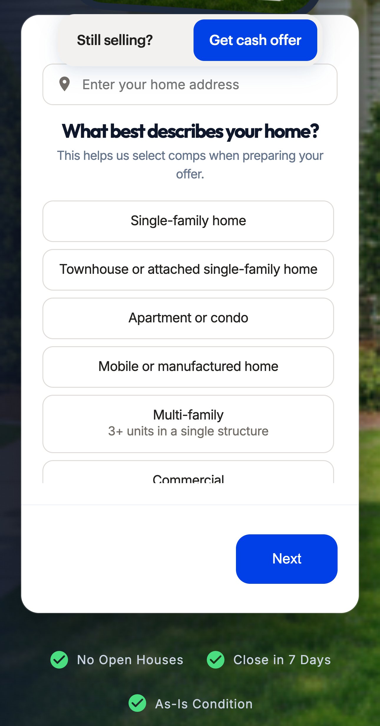
Move the same button to a slim bottom bar, clear of the form, and let a tap take the seller straight to the address field.
On the right — the same screen, with the pill moved to the bottom.
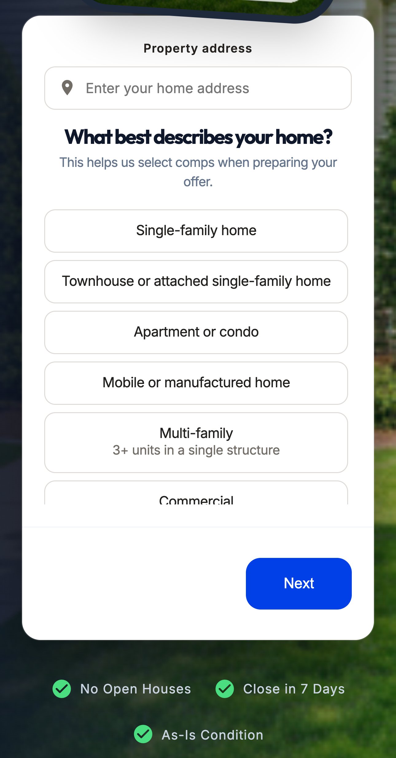
The button is the right idea, only in the wrong place. At the bottom it works without hiding the form.
The “Home Insights” block is for people who are not selling yet. A tap on “Get My Free Home Report” opens nothing and jumps to the top; “Get Your Cash Offer” in the local section does the same.
Checked live 6 Oct 2026, iPhone 430×822 and desktop 1440 · open the page ↗
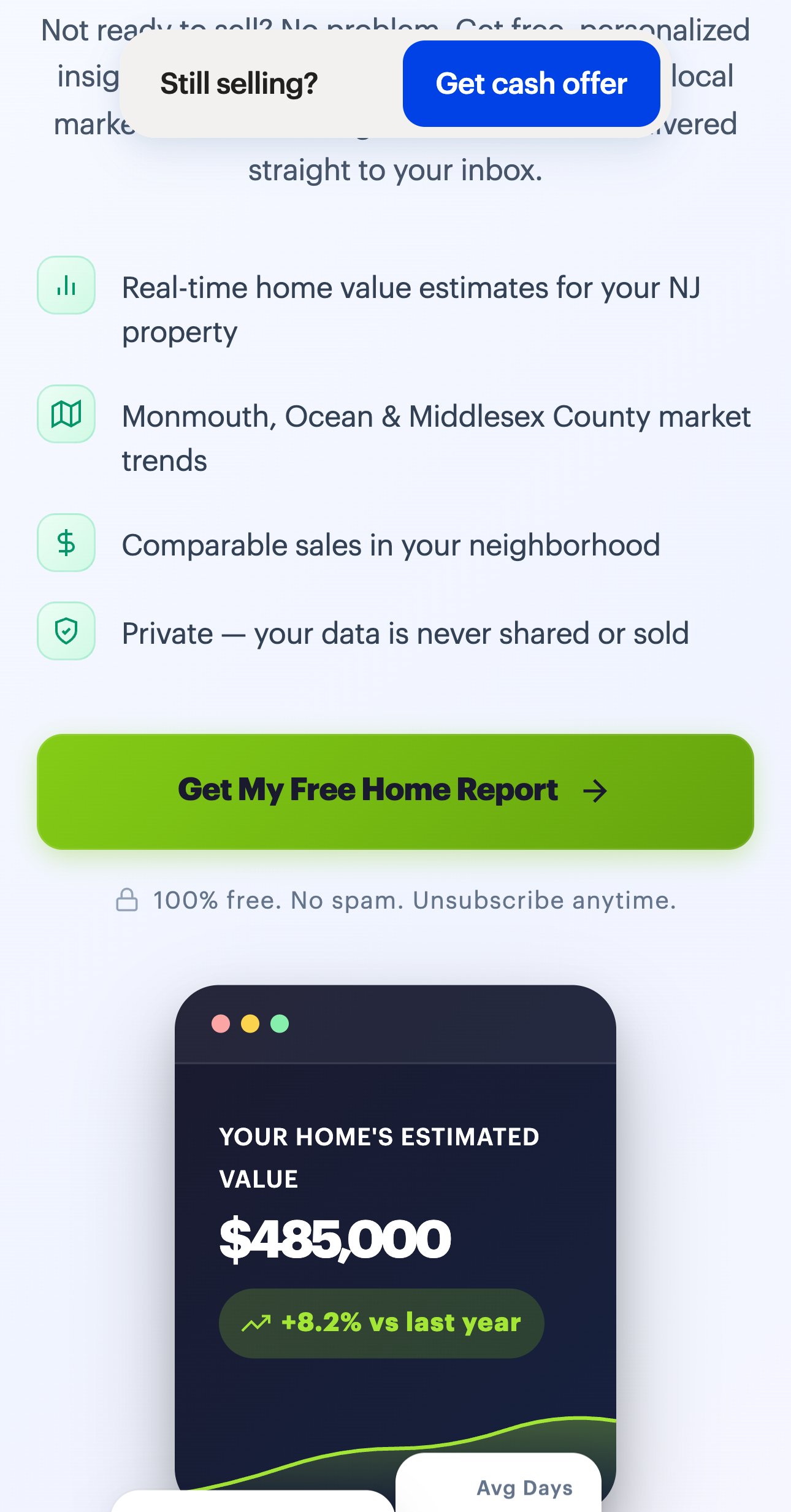
Make the button work: a short panel sends the report by email and saves the contact in HubSpot, already installed.
On the right — the same section with that panel.
Where should we send it?
100% free. No spam. Unsubscribe anytime.
It is the only path for sellers months away from a decision. Today it ends without an email left.
The address field suggests addresses as you type — from the whole country. For “200 Craig Rd”, your office street, the first two are in Kentucky and Mississippi. For “12 Main St” all five are in Alabama.
Checked live 6 Oct 2026, iPhone 430×822 and desktop 1440 · open the page ↗
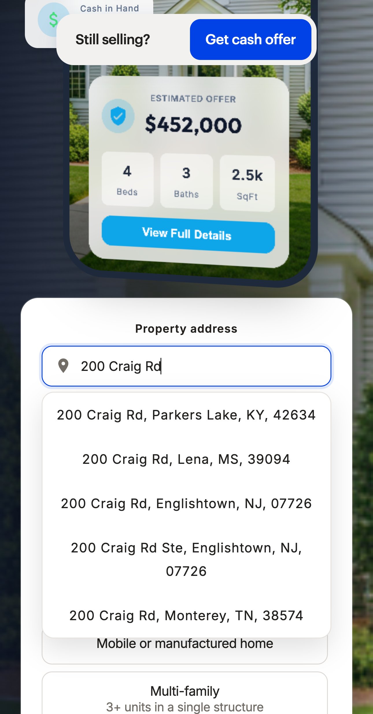
Tell the same suggestion service to put New Jersey and New York first. Nothing else changes in the form.
On the right — the same field and the same typed text, with that setting on (real results).
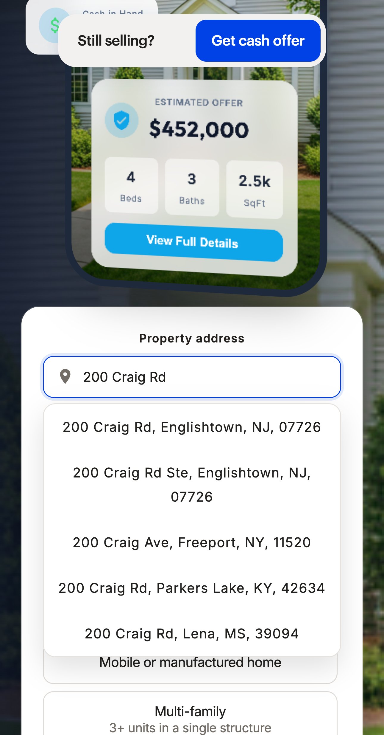
A seller who picks the wrong state sends an address you cannot price. Local results first mean one tap on the right house.
The form has five steps, from the address to contact details. A progress line is built into it, but hidden on every step, on phone and desktop — so the seller cannot tell whether the next tap is the last one.
Checked live 6 Oct 2026, iPhone 430×822 and desktop 1440 · open the page ↗
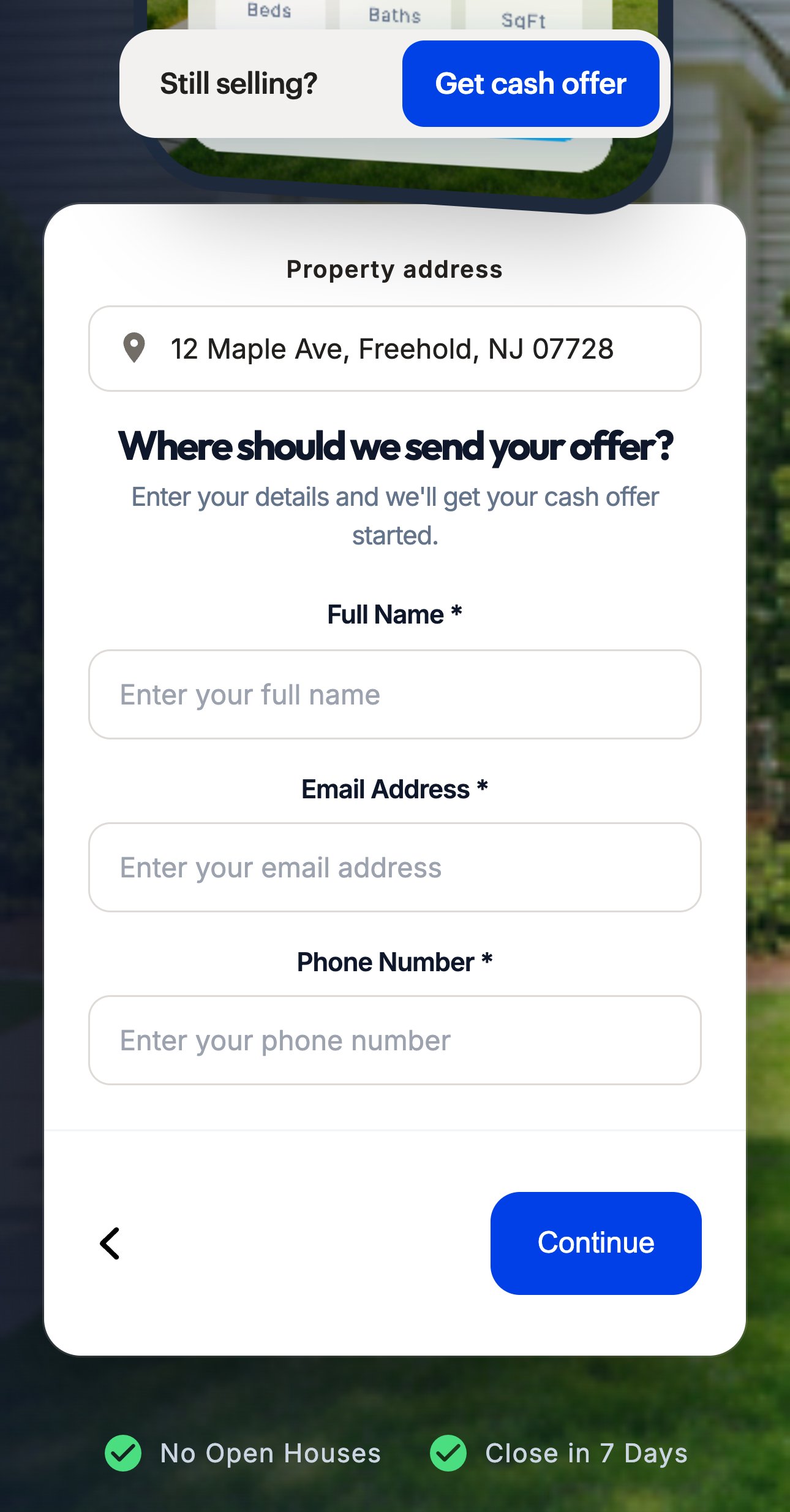
Switch the line on and set it to the real five steps. Same card, same fields, same order.
On the right — the real last step of your form with its own line shown.
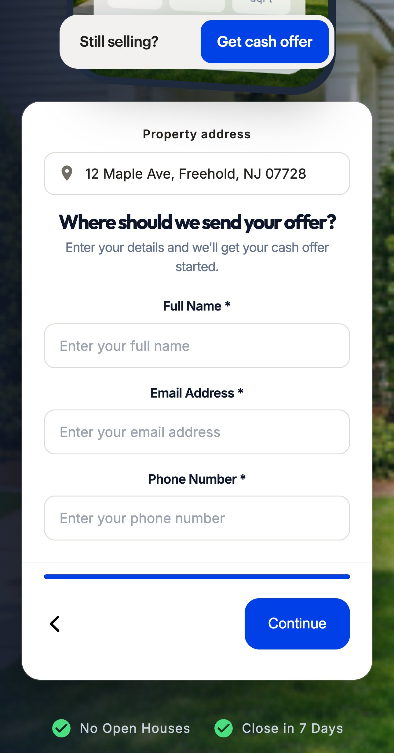
A visible end makes the last step — name, email and phone — feel like one more tap instead of an open-ended form.
The stats band shows 2,500+ homeowners served and a 4.9★ Google rating.
The rating is plain text: it links nowhere, and the reviews page names no source either.
Checked live 6 Oct 2026, iPhone 430×822 and desktop 1440 · open the page ↗
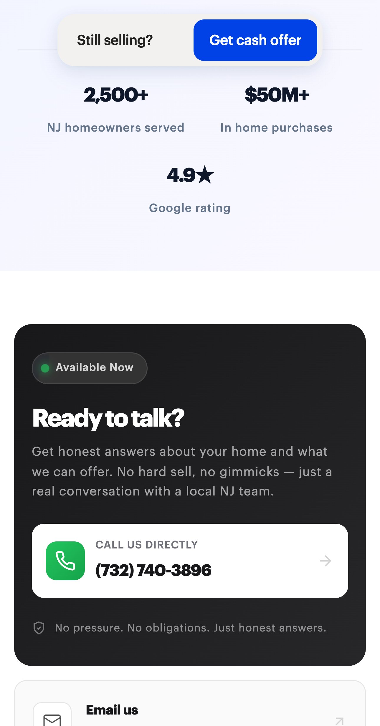
Link the rating to the Google profile it comes from, so one tap opens the real reviews.
On the right — the same band, with the rating made checkable.
A seller who is about to call a cash buyer looks for proof. One tap to the real reviews gives it.
The looping videos start downloading as soon as the page opens, even those far below the first screen — one alone is 18.7 MB. The first-screen pictures are 1.3 MB of PNG files.
On slow 4G, 5 seconds after opening, the house photo in the first screen is still grey.
Measured 6 Oct 2026: Lighthouse mobile, median of 5 runs; frames on slow 4G · open the page ↗
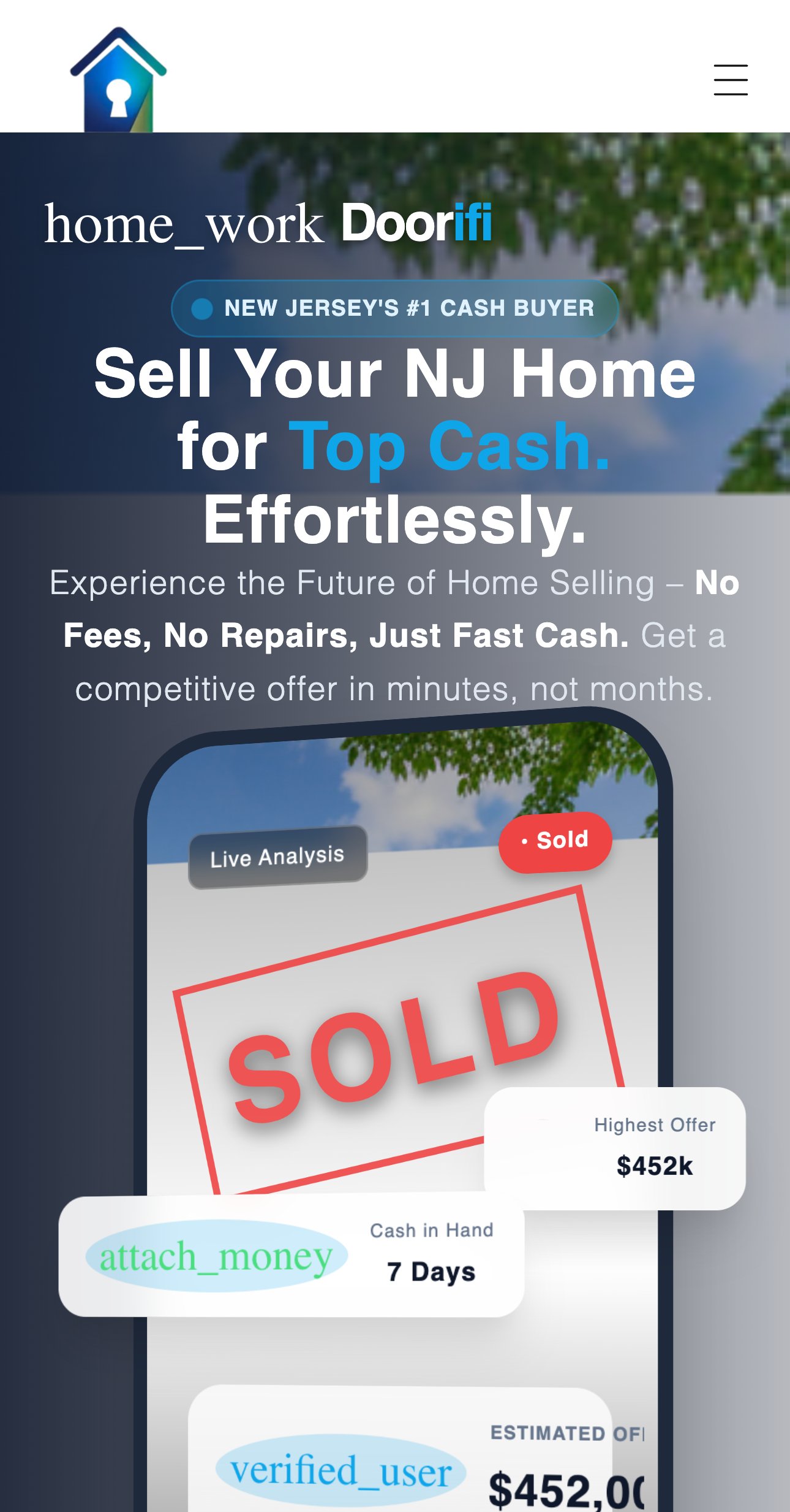
Videos load only when the visitor scrolls to them, and the first-screen pictures come from Shopify in a light web format. The page looks the same — it just arrives sooner.
On the right — the same moment with that change.
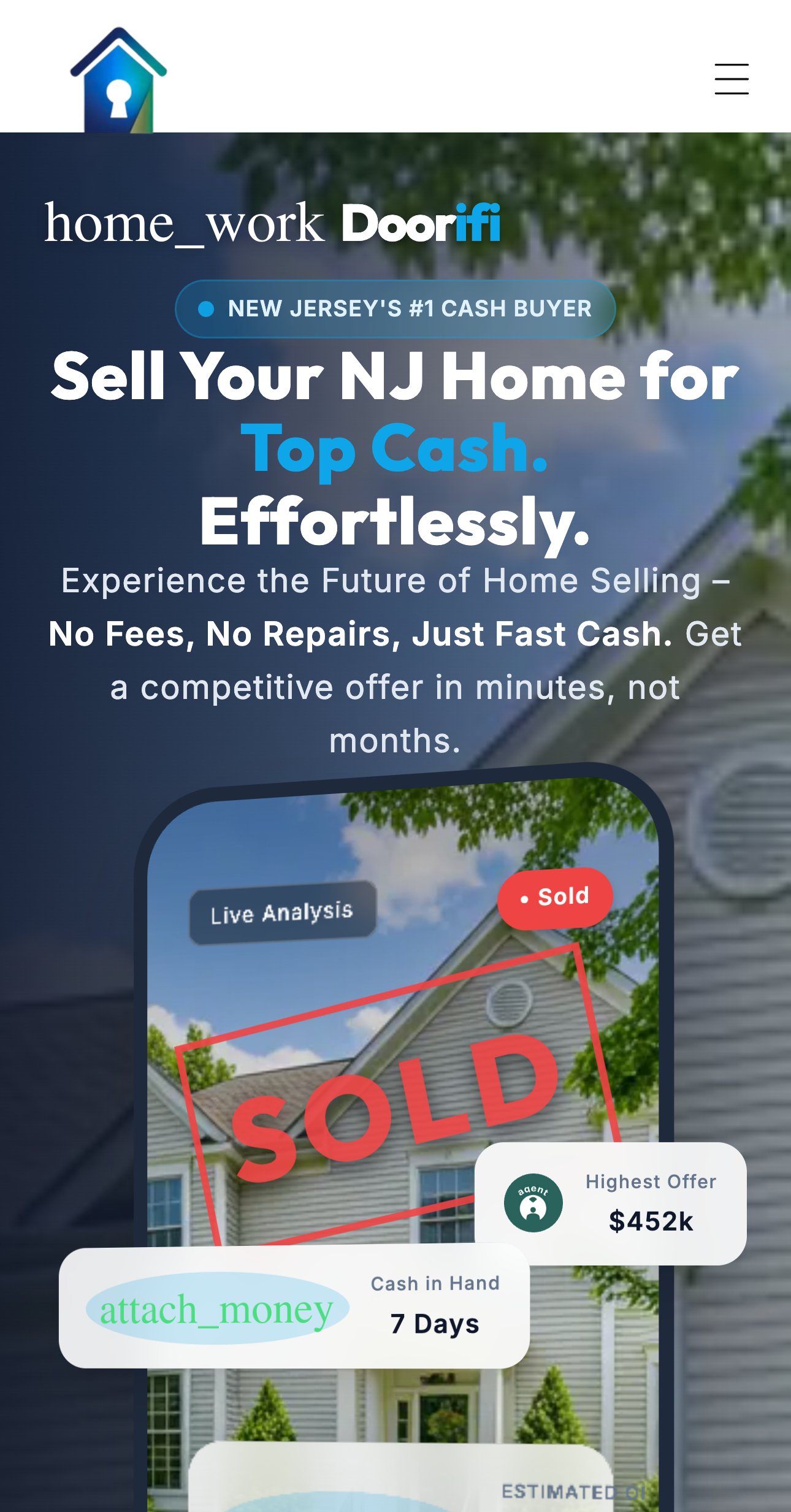
Sellers come to a cash-offer page on a phone, often on mobile data. The first screen is complete sooner.
Proposals
The first phone screen holds a mock phone with a “SOLD” stamp and floating cards; the address field starts 1,062 px down, below it.
Checked live 7 Oct 2026, iPhone 430×822 · open the page ↗ · open the redesign ↗
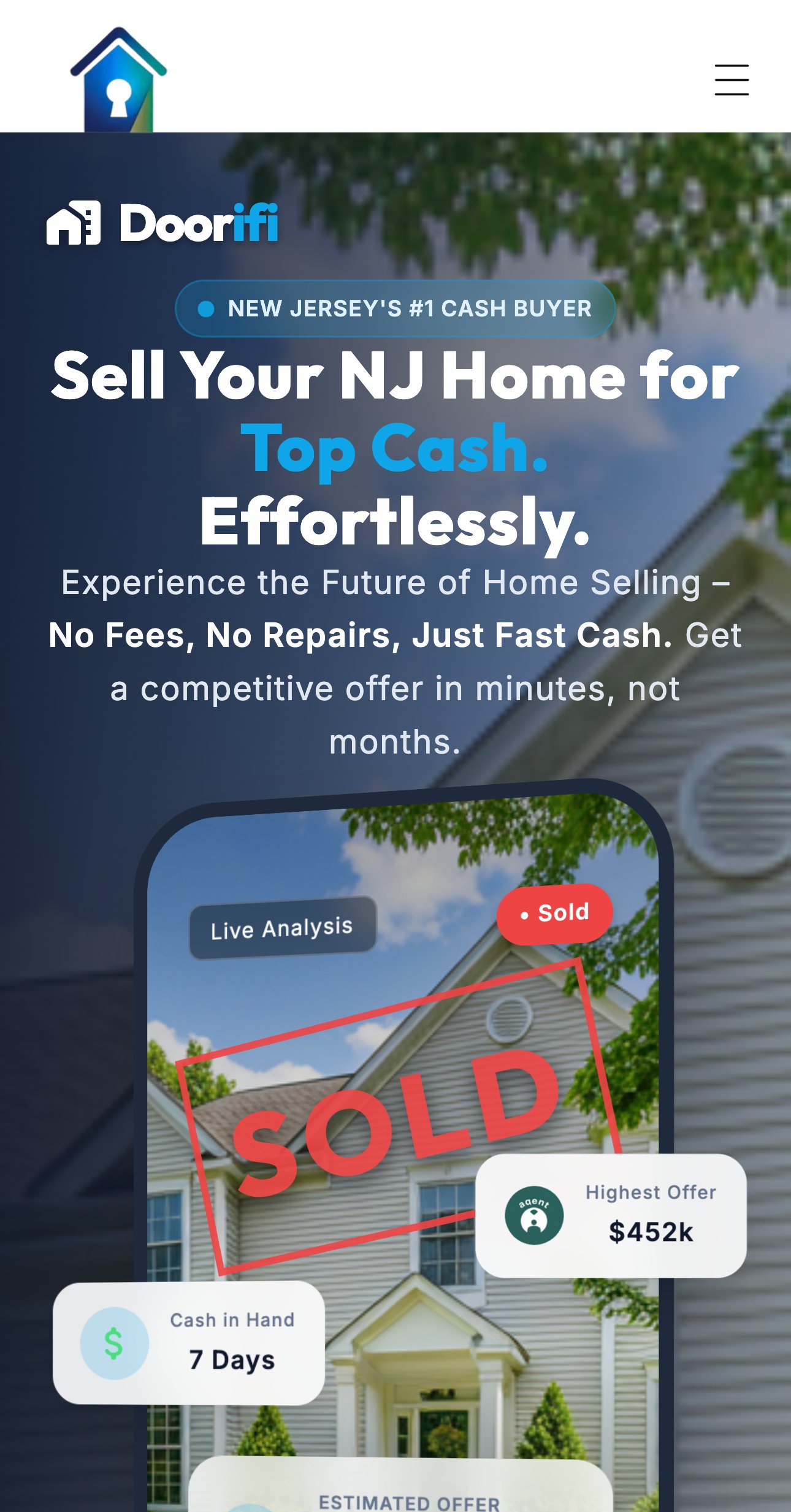
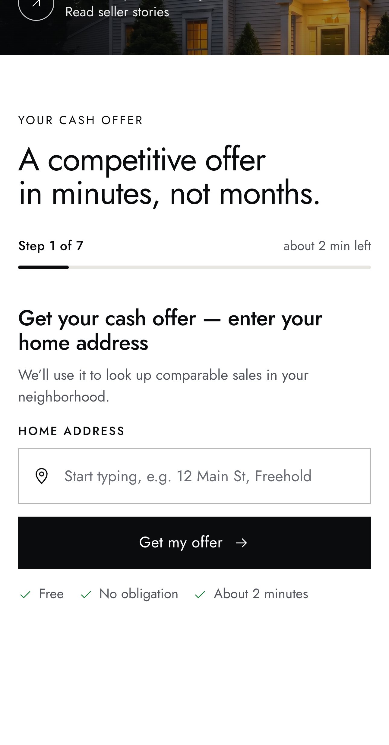
A new home page built around one action — the address and “Get offer” on the first screen — then one question per step with a progress line, autofill on contacts and only trust figures checked on your site.
On the right — the redesign concept, live. Includes fixes 01, 03 and 04.
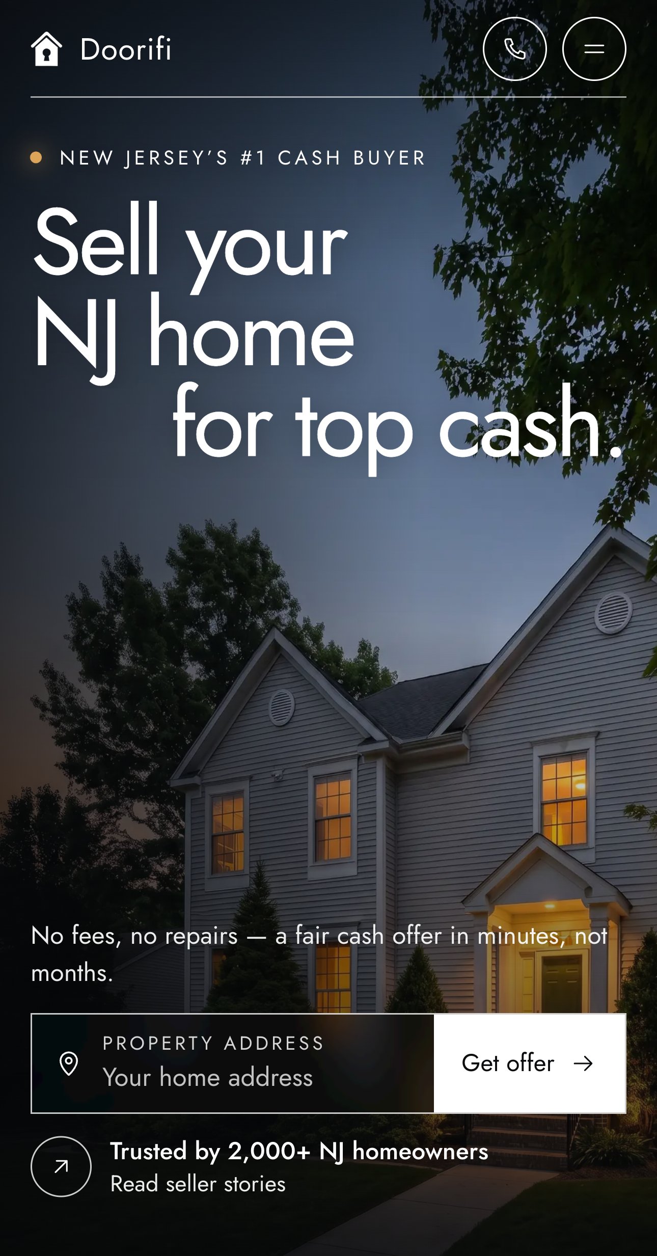
Every visitor sees where to start without scrolling, and each step asks one thing.
The form shows the address and the home type on one card, with no progress line.
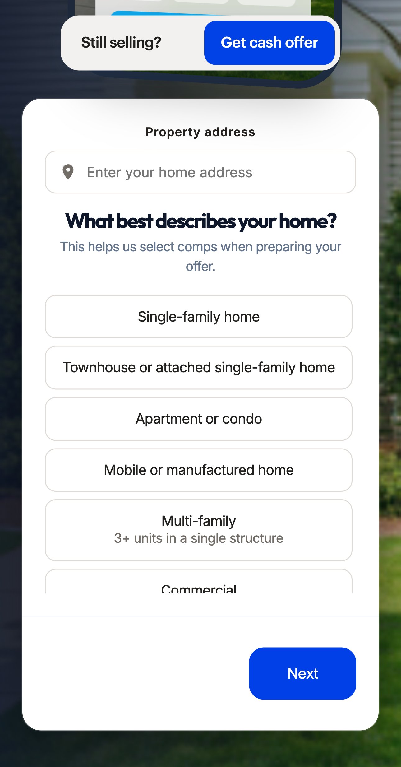
Step 1 asks only for the address; the next questions come one per screen.
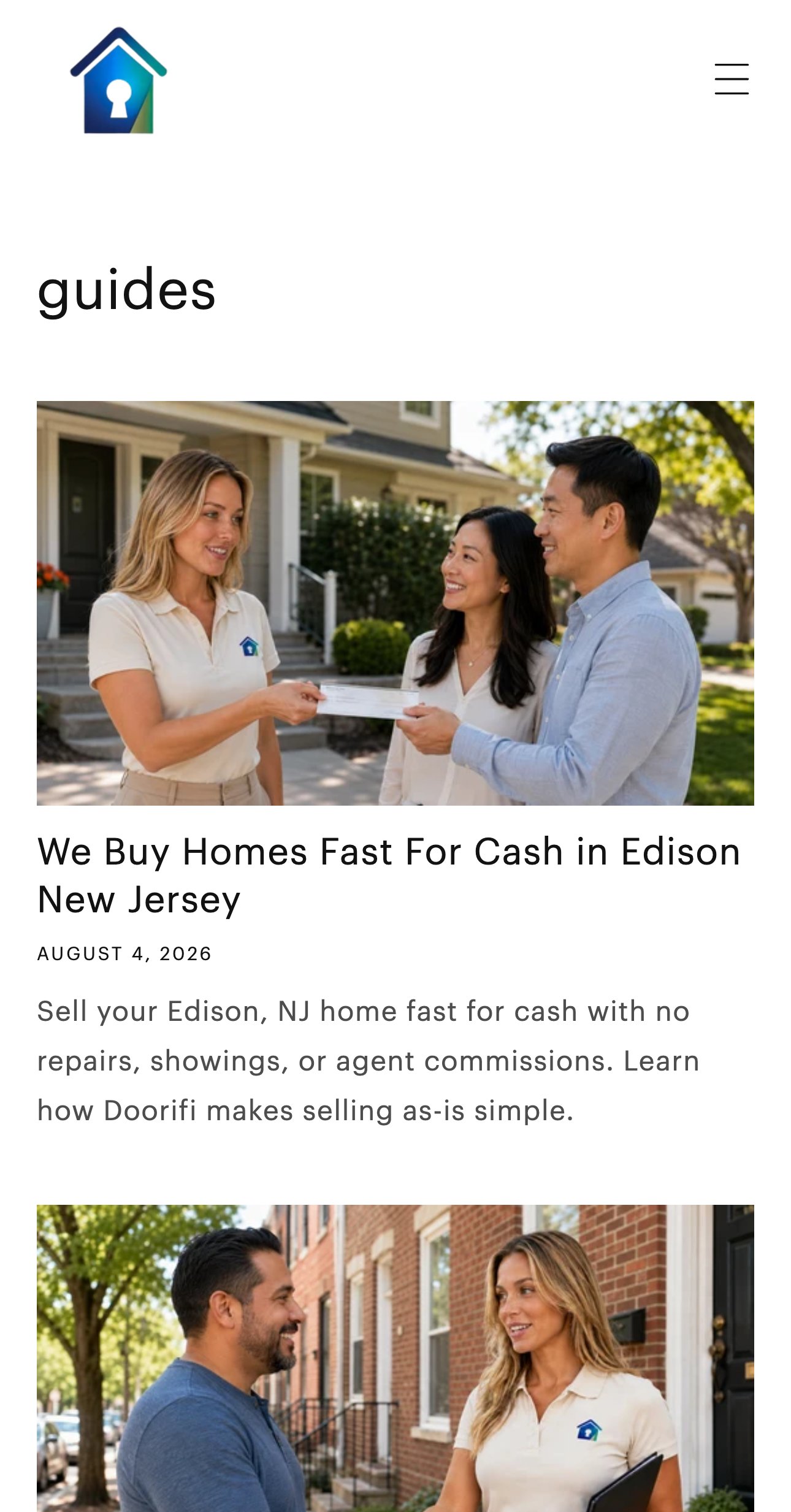
The guides blog holds 12 articles, mostly “we buy houses for cash in <town>” pages; the newest one is dated 4 August 2026.
Sellers who search questions — what cash buyers pay, selling with tenants, probate — find other buyers’ articles.
Checked live 6 Oct 2026 · open the page ↗
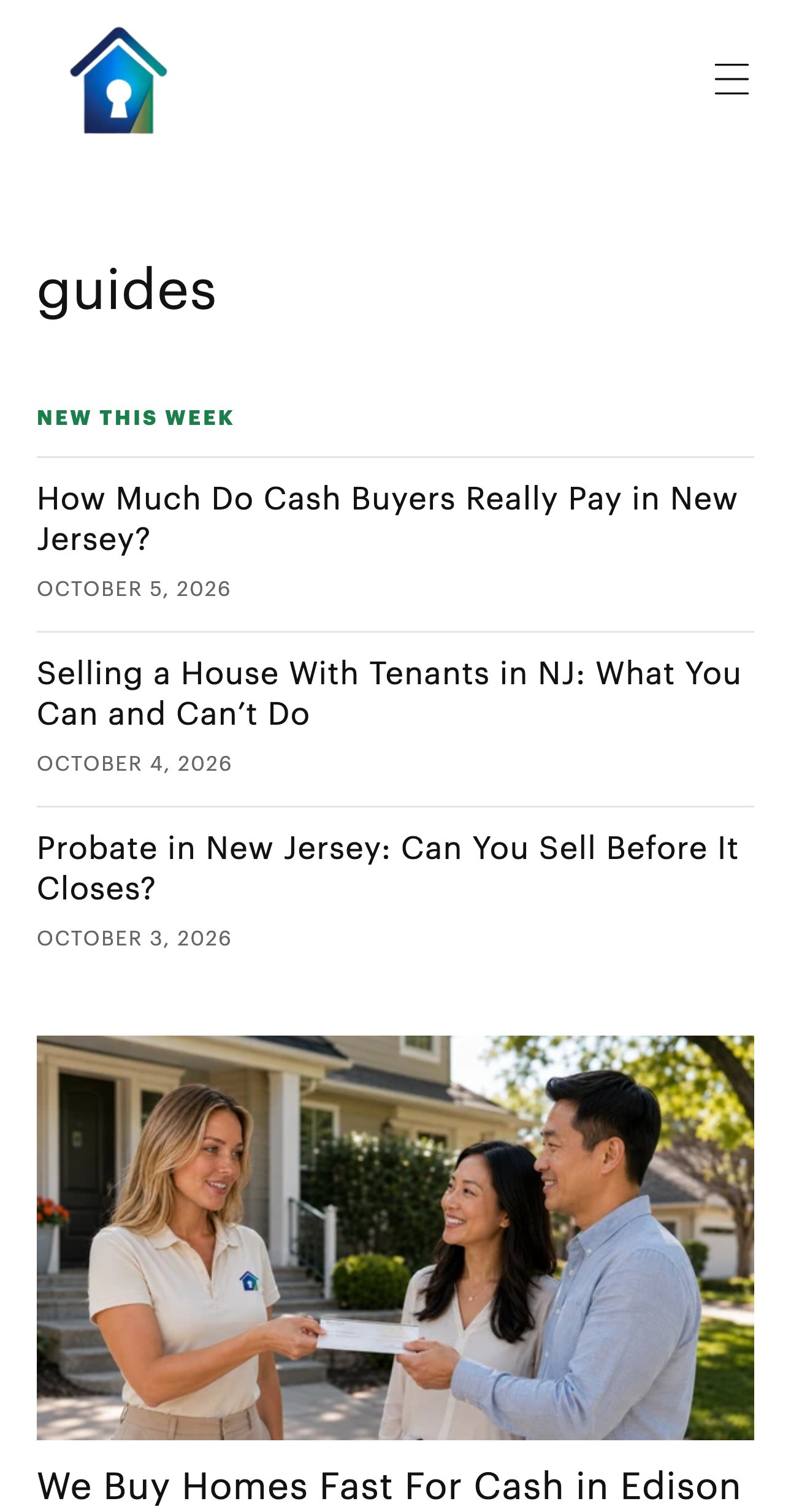
We set up a new SEO article every day in the guides blog you already have: answers to the questions NJ sellers search, in your voice — published automatically or saved as drafts.
On the right — the same page with new articles (illustration).
A cash sale is rarely decided on the first visit. Articles bring sellers in from search and keep Doorifi in front of them until they ask for an offer.
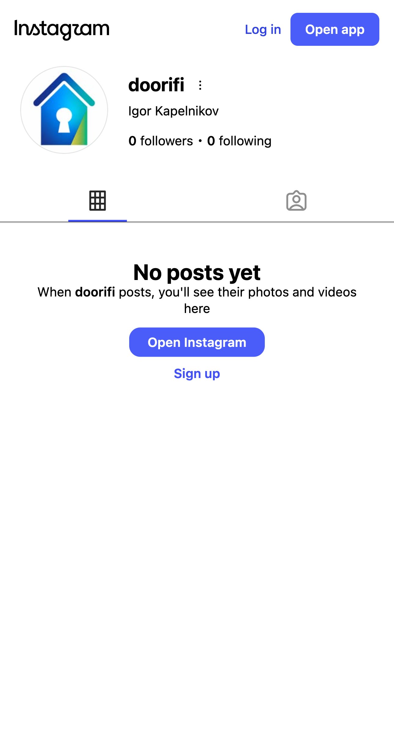
@doorifi already exists on Instagram with your logo — and has 0 posts and 0 followers. The site does not link to it yet.
A seller who looks Doorifi up before calling finds an empty profile.
Checked 6 Oct 2026, public profile view · open the account ↗
We run @doorifi every month: content plan, posts, stories and reels about selling a house in New Jersey, and a bio that sends people to the offer form.
On the right is your profile as it could look (illustration, photos from your own site).
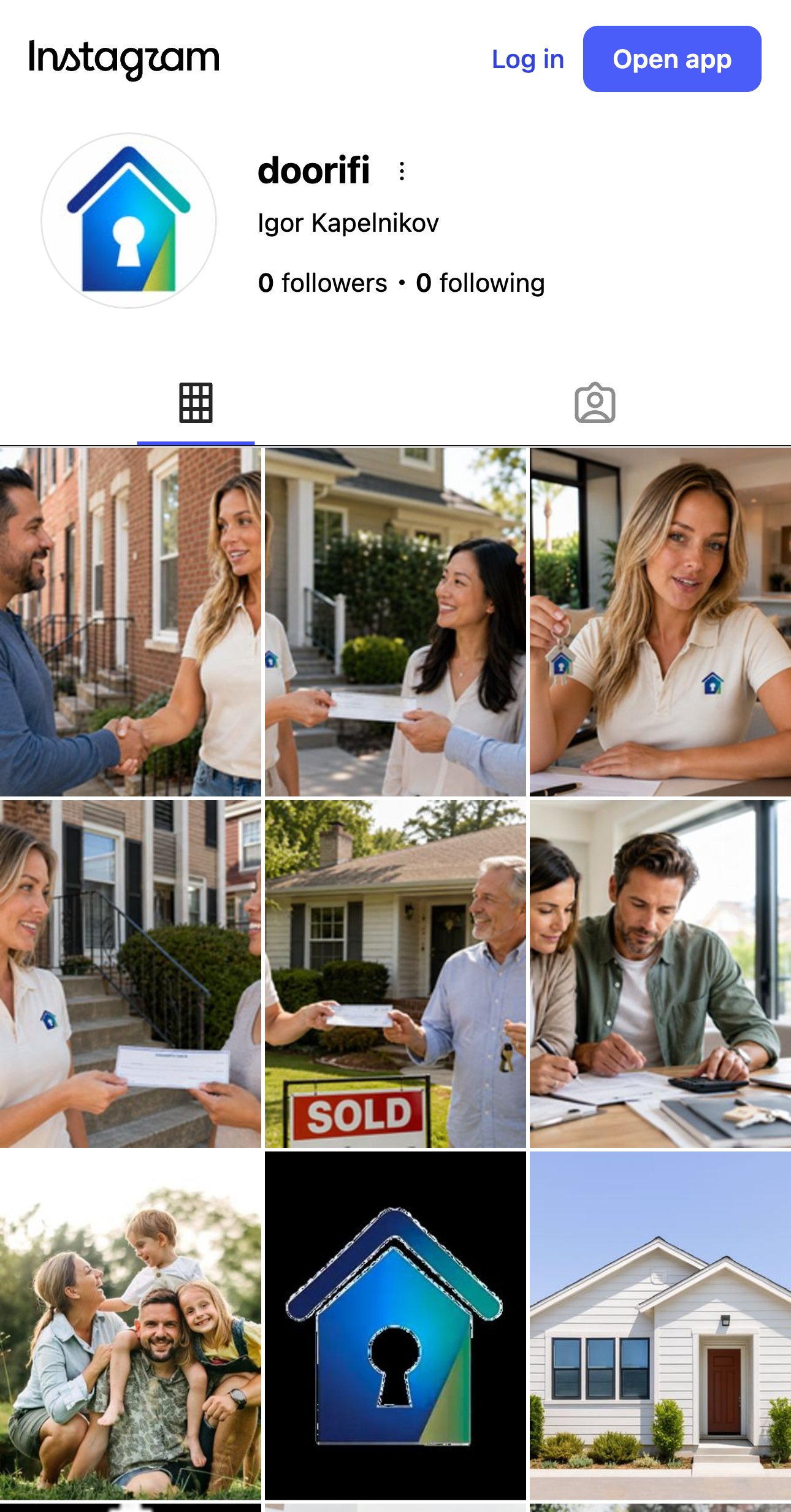
Sellers check a cash buyer before they call. An active account with real people and sold homes answers “are they real?” and leads to the form.
Property address comes before name, email and phone.
Divorce, inherited, as-is and hoarder houses each have their own guide, plus local pages for Monmouth and Ocean County.
A direct phone number, email and FAQ in one place.
No countdowns and no “someone just requested an offer” pop-ups.
Google Analytics and HubSpot already load on the home page, so new forms can report leads from day one.
We agree on these six changes and start there — the floating button, the home-report button, local address suggestions, the progress line, the rating link and the page weight. 10 hours of work ($200), and it is the part that changes how many visitors reach the offer form.